georgette studios
website design
ruby rare
location: margate, kent
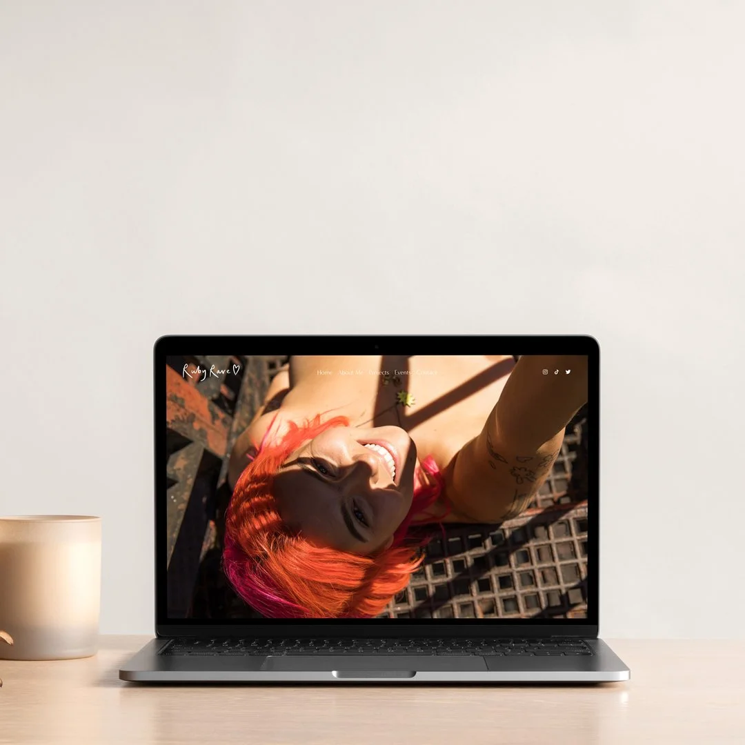
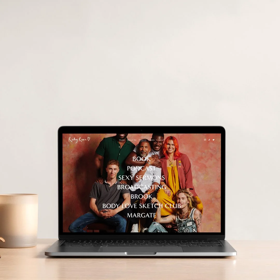
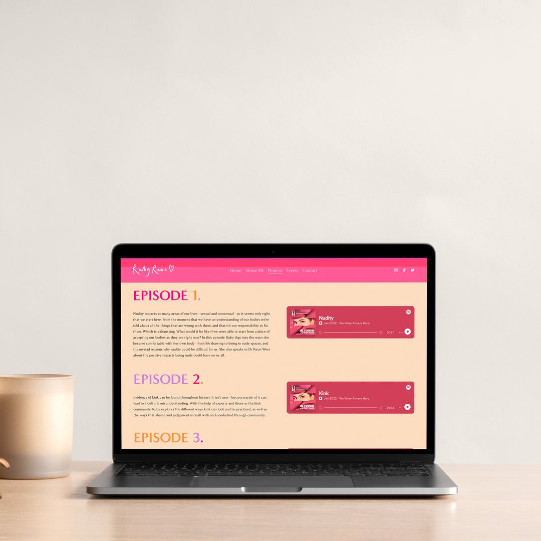
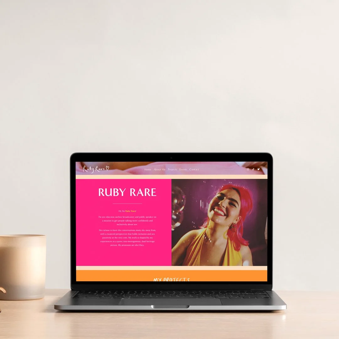
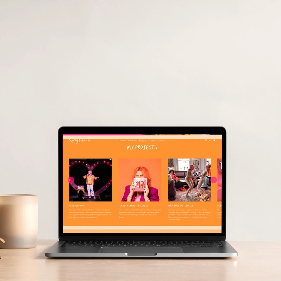
ruby rare is a sexual health and sex positivity educator, author of sex ed: a guide for adults, part of BBC’s ‘on the cards - understanding HIV’ documentary, journalist, co-founder of the body love sketch club, and that’s just listing a few of her wonderful achievements.
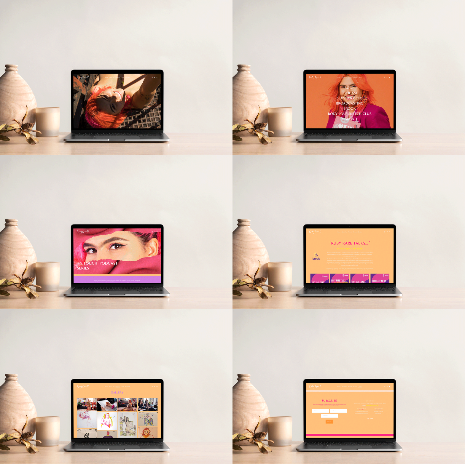
after already establishing herself on social media (with a following of over 90k+) ruby thought it was time to invest in a custom built website, where she could showcase all her amazing work, and have a safe space on the internet where people could find her. and she had one important factor: that the website reflected her personality; fun, colourful, friendly and NAKED.
so my mission was to do just that: create a website that reflected her joyful, colourful and bubbly personality and showcase her fab achievements so far…
the process
when ruby and i first sat down to discuss her ideas for the website, it was clear to me that she wanted something that really reflected her personality; bubbly, colourful, fun, sexy & confident. as well as it being a safe, yet fun space where she could shout about all her wonderful achievements, projects and work thus far. there was no initial moodboard for this project, just a mutual understanding and vision. for ruby, it was so important for her website to really feel like her.
mariachi margate
location: margate, kent
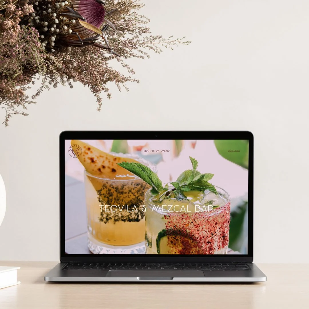
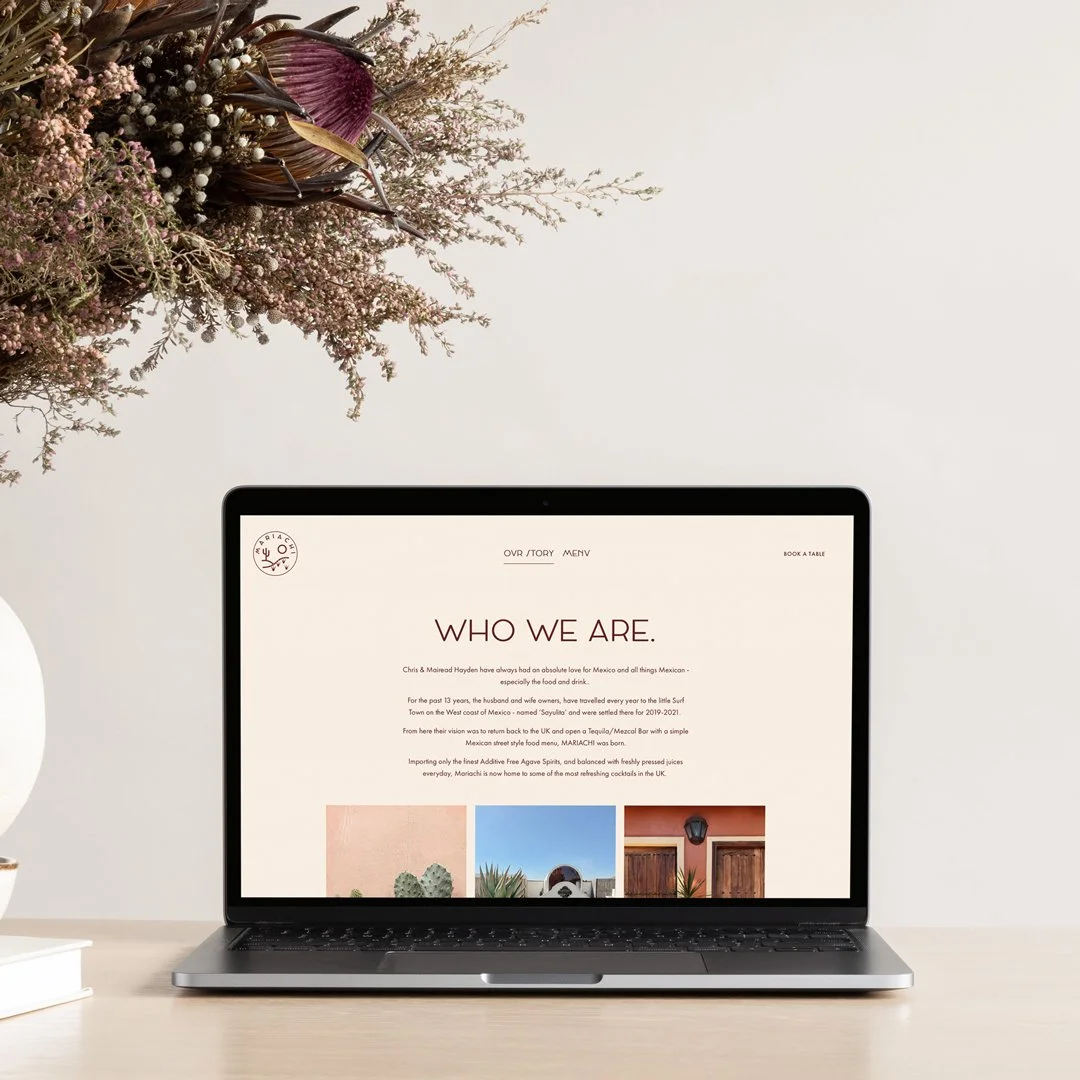
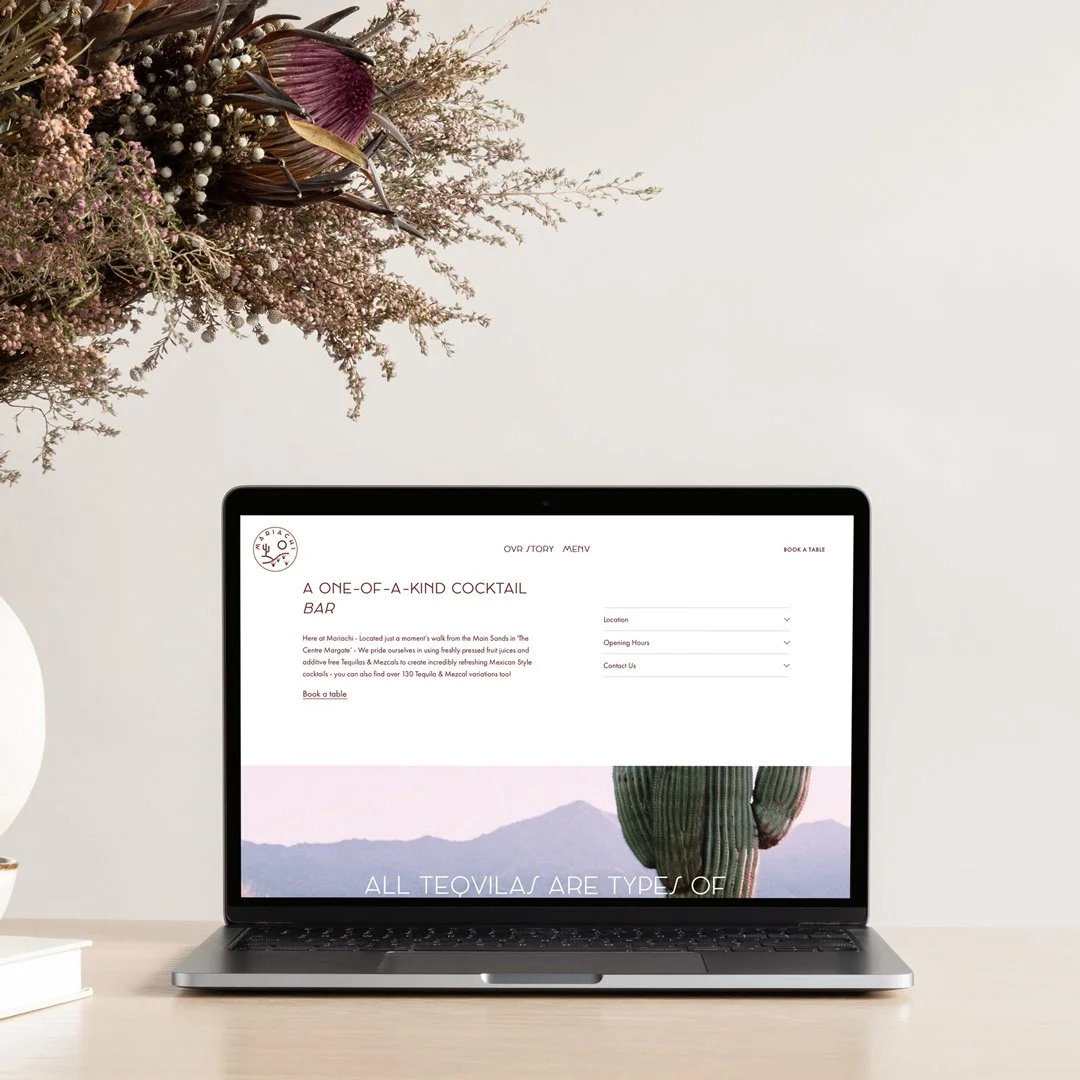
opened in 2021, mariachi margate is a tequila and mezcal bar, serving simple Mexican street style away, located in the centre at margate. the husband and wife owners, have travelled every year to the little surf town on the west coast of mexico - named ‘sayulita’ and were settled there for 2019-2021. From here their vision was to return back to the UK and MARIACHI was born.
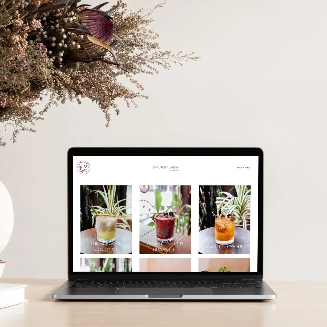
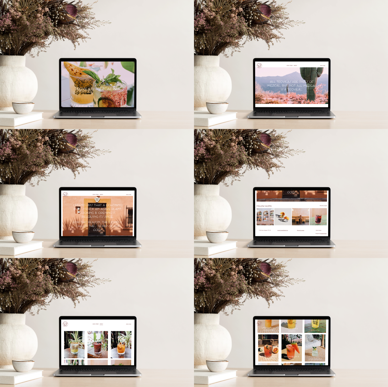
my mission was to create a simple, yet stunning website that looked cohesive with the interior design within mariachi itself, whilst also showcase their unique and colourful cocktails.
the process
chris & mairead, founders of mariachi, had a few websites that they really liked the look off, with the common themes being; simple, clean, easy to navigate & picture heavy. i used these sites as references and worked on replicating the simplicity, whilst factoring in mariachi’s unique visual aesthetic seen within the bar itself and through their branding. whilst playing homage to their roots in saylita, mexico, which is where this all started. cocktail imagery by me.
archive kitchen & homestore
archivehomestore.co.uk
location: ramsgate, kent
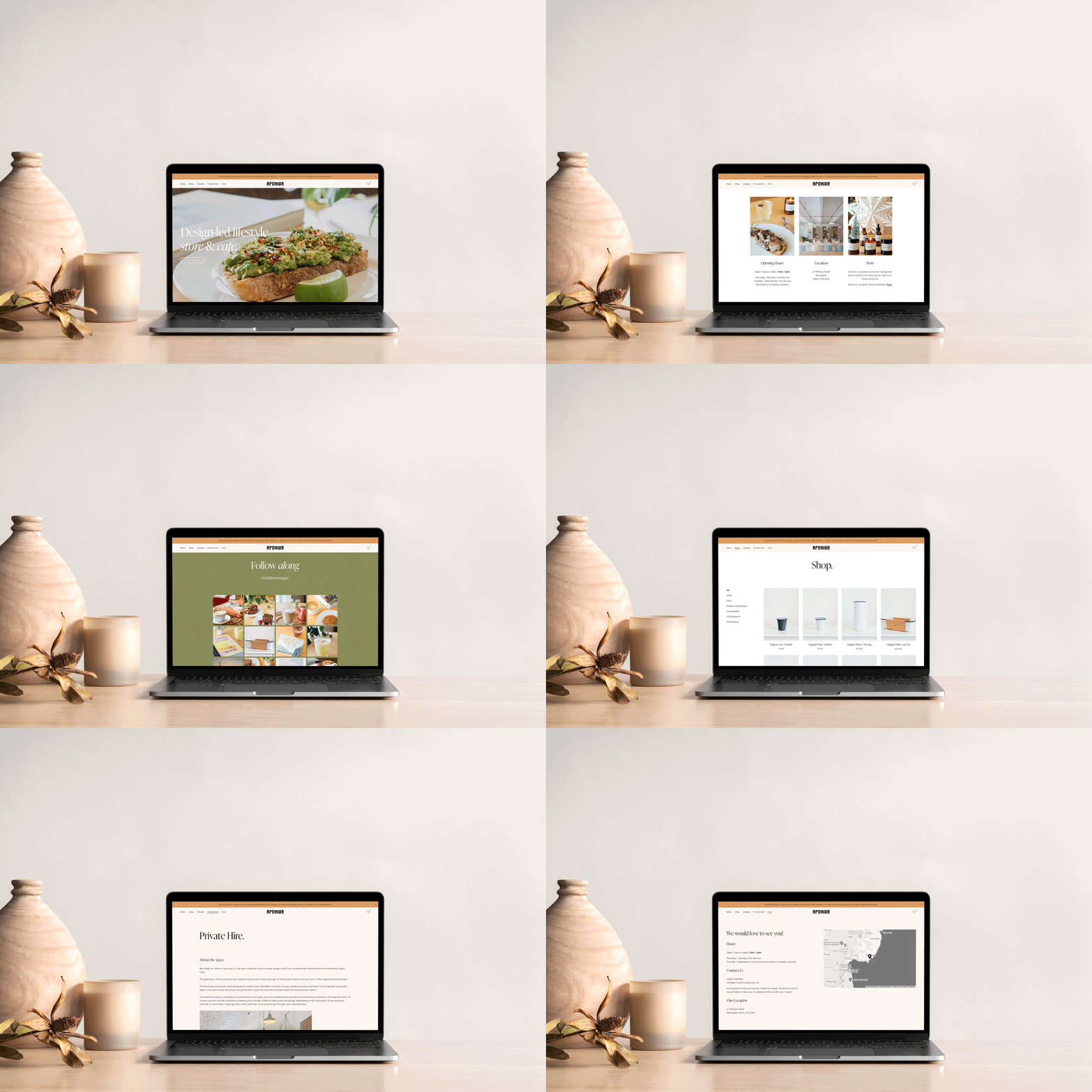
opened in 2015, archive kitchen & homestore is a design-led lifestyle store located in ramsgate, kent. their mission was to create a beautiful space that brings together speciality coffee and delicious food, in a place that offers a unique collection of interested home-wares.
my mission, was to tie this vision together through a beautifully curated website that is instantly recognisable with their unique aesthetic and also produce a social media strategy plan that allows them to connect with their customers and followers whilst providing content that shows off their delicious food, style, products and coffee and ‘sell's’ the danish-inspired lifestyle that their store provides. it had to be easily navigable with imagery that showed off the danish-interiors and food photography that captured their famous meals.
we also decided that having an online store would be a great outlet for them to have to allow people who don’t live near by to have the opportunity to purchase products.
the process
initial ideas to moodboards, concepts to key words and endless inspiration are the main factors when it comes to designing a website that portrays a brands vision, business goals and style. i really believe that it’s so important to have all the factors of your visual business cohesive so that you start to build a brand and brand awareness. for archive, we knew simplicity really was key when it came to their website (and socials!)
we are samudra
wearesamudra.com
location: rye, east sussex
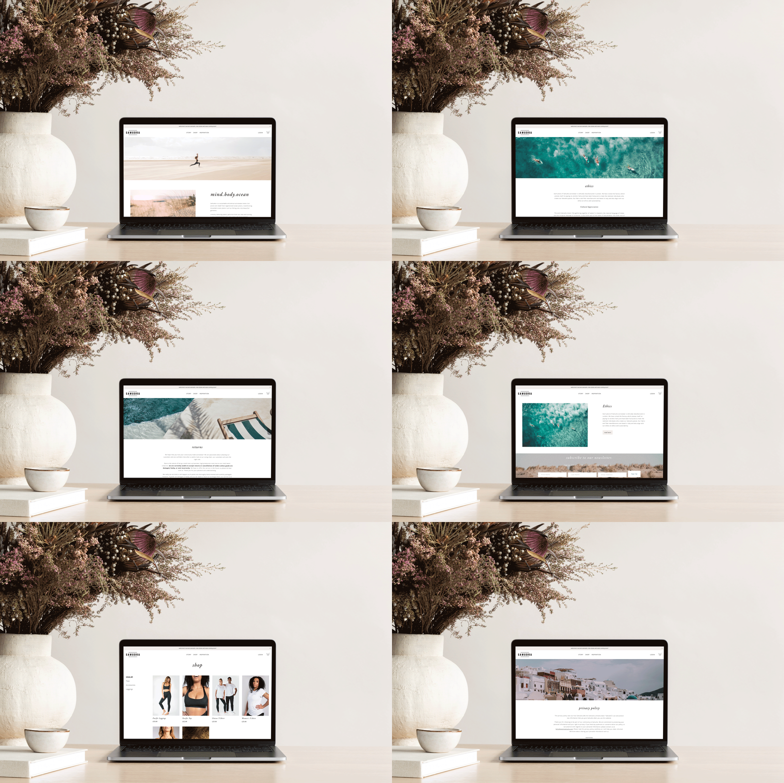
we are samudra are a sustainable and ethical activewear brand. their pieces are made from regenerated ocean plastic, transforming discarded ocean plastic such as fishing nets into beautiful garments. literally removing plastic pollution from our seas and turning it into something beautiful and useful. we have created timeless activewear with elegance and comfort in mind to complement every silhouette. if looked after, they should last a lifetime.
samudra is heavily inspired by the sea, so it was really important that the website reflected this. with the main use of the website being an online store, they wanted the site to easily navigable and simple, whilst clearly showing their passion for sustainability and protecting the ocean. keep the colour palette calming and neutral, it allowed the images to shine and their products do the talking.
the process
initial ideas to moodboards, concepts to zoom calls and endless inspiration are the main factors when it comes to designing a website that portrays a brands vision, ethics and a passion for sustainability. we are samudra is an activewear company that has a strong passion for protecting the oceans, and a love for nature. it was really important that the website reflected this through the imagery, the colour palette and keeping with a minimal, neutral palette, whilst being easily navigable for new customers.
number nine communications
numberninecommunications.co.uk
location: canterbury, kent
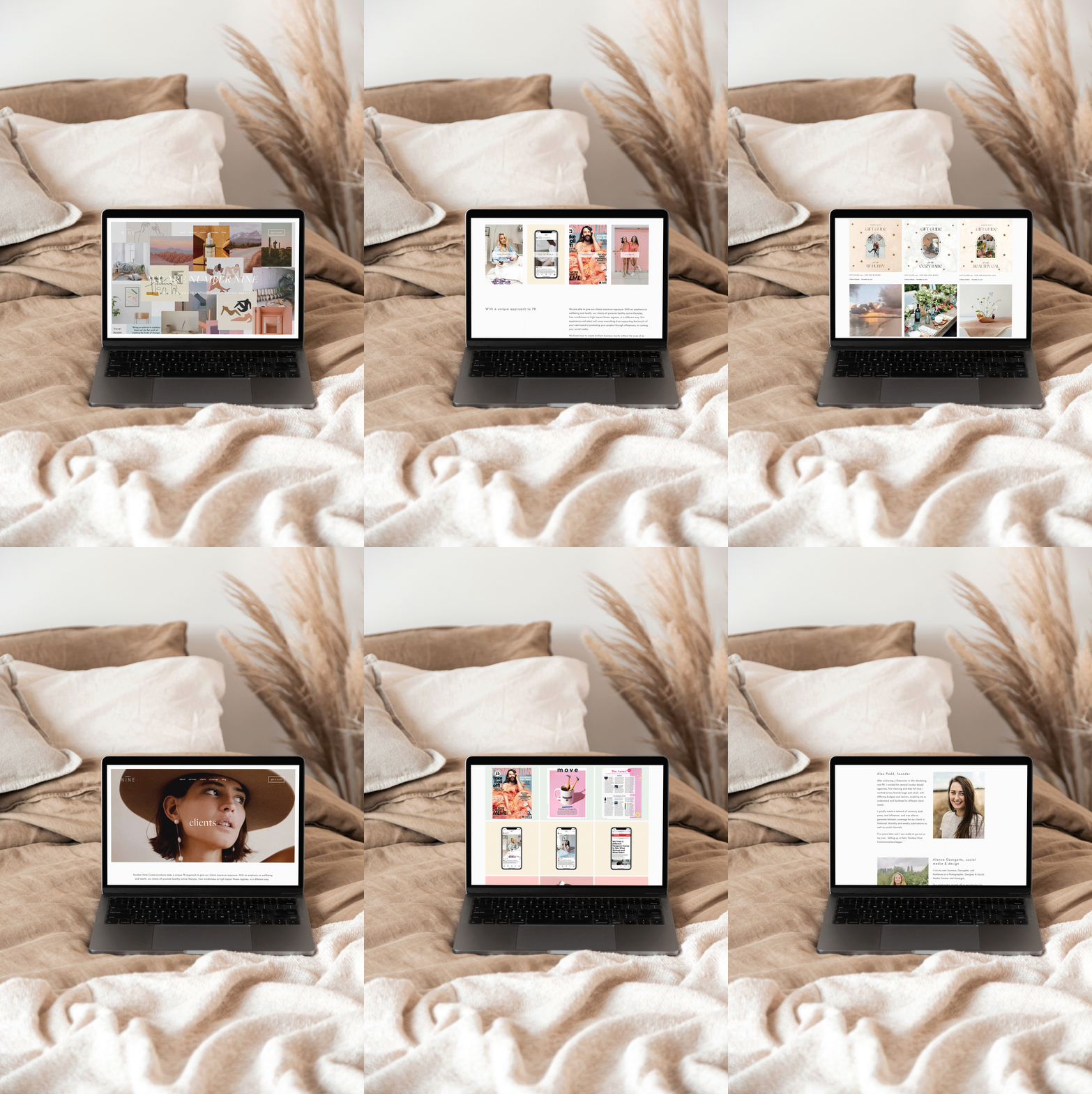
number nine communications is an integrated pr and communications agency based in canterbury that focuses on promoting up-and-coming creativity.
the brand is heavily inspired by fashion, wellness and art, with a strong love for all things travel, health and blogger related, so it was really important that the website reflected this. whilst keeping in line with these themes, it was also important the website was easily navigable, minimal and straight forward to use. promoting the companies’ services, clients and coverage was also a key point, so we created a blog that would keep clients and followers up to date on new trends, styles, products, or holidays.
number nine communications is known for their very relaxed approach towards pr, so it was important to portray this element through the site; as well as keeping the colour palette fresh, minimal, and feminine.
the process
initial ideas to moodboards, concepts to key words and endless inspiration are the main factors when it comes to designing a website that portrays a brands vision, business goals and style. number nine communications is a young-creativity led pr agency, so it was really important that the website reflected this through the imagery, the colour palette and keeping with a minimal, on-trend look, whilst being easily navigable for new clients.
enquire
interested in working together to build your dream website? i would love to hear more about what you are after and figure out a way for us to make magic. i offer a range of different packages to suit every vision and budget. website prices start from £1,500.
please fill out the form below or 💌 hello@alannageorgette.com
